Fonts and Their Psychological Associations: Unveiling the Hidden Meanings
In the realm of design and communication, fonts play a crucial role beyond mere text representation. They possess the power to evoke emotions, set the tone, and convey subtle messages to the audience. Understanding the psychological associations of different font types can significantly impact how we perceive written content. In this article, we'll delve into the world of fonts, exploring their psychological connotations and how they influence our perception.
Fonts are not just arbitrary visual elements; they are potent tools that can communicate more than just words. The choice of a font type can spark emotions, set a context, and even enhance the overall experience of reading. This article takes a deep dive into the world of fonts and their psychological implications, unveiling how they contribute to shaping our perceptions.
The Impact of Fonts on Perception
The Subconscious Effect
Fonts silently work their magic on our subconscious minds, influencing how we interpret the text. Different fonts can make the same message feel urgent, casual, formal, or even playful. They tap into our emotions without us even realizing it, creating a connection between the reader and the content.
Fonts and Brand Identity
For businesses, font selection is a cornerstone of brand identity. Just like colors, fonts carry associations that can either align or clash with a brand's values. A technology company might opt for a sleek sans-serif font to signify progressiveness, while a law firm could choose a classic serif font to convey tradition and reliability.
Cultural Variations
Fonts also bear cultural significance. A font that evokes a sense of formality in one culture might not hold the same weight in another. It's vital to consider the cultural background of the audience to ensure the message is conveyed as intended.
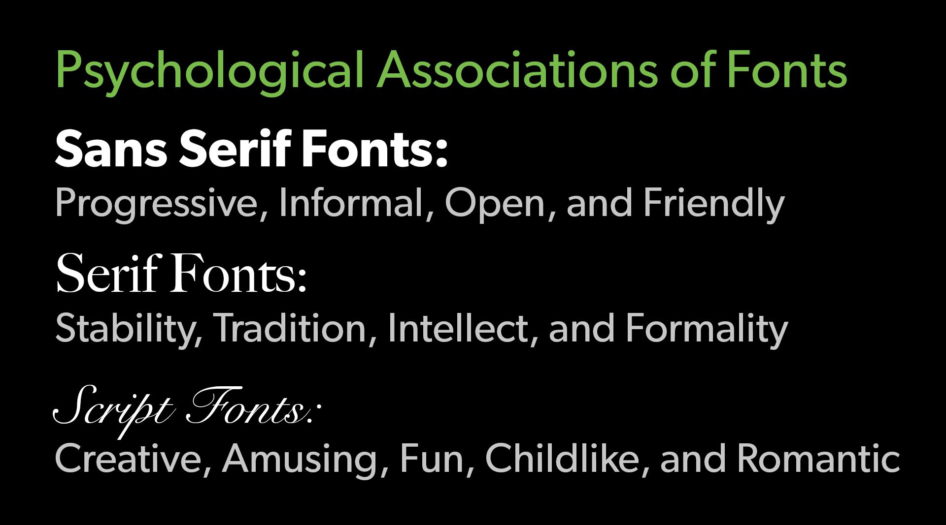
Unveiling Sans Serif Fonts
Progressive Vibes
Sans-serif fonts, characterized by their clean lines and lack of decorative extensions, exude a modern and forward-thinking vibe. They're often associated with innovation, making them a go-to choice for tech-related content.
Informal Feelings
The absence of extra embellishments in sans-serif fonts gives them an approachable and casual aura. They are perfect for content that intends to establish a friendly connection with the reader.
Open and Accessible Aura
Sans-serif fonts are inherently easy to read, making them an excellent choice for digital content. Their simplicity and clarity ensure that the message comes across effortlessly.
Friendly and Welcoming Embrace
The clean and straightforward nature of sans-serif fonts creates an air of friendliness. They feel like a warm invitation to engage with the content.

The Power of Serif Fonts
Stability and Reliability
Serif fonts, with their elegant and timeless strokes, evoke a sense of stability. They are often used by brands that want to establish trust and dependability.
Tradition and Timelessness
The serifs, or small decorative lines, attached to the letters connect serif fonts with a sense of tradition. They resonate well with content that values history and heritage.
Intellectual Engagement
Serif fonts encourage a deeper level of engagement, making them an excellent choice for educational material and long-form content. The serifs guide the eyes along the text, allowing for prolonged reading.
Formal and Professional Impression
When professionalism is key, serif fonts step up to the plate. Their sophistication adds a formal touch, making them suitable for documents like resumes, academic papers, and official correspondence.

Script Fonts: Beyond the Text
Unleashing Creativity
Script fonts break the mold of traditional typography, often resembling handwritten calligraphy. They ignite creativity and work wonders for content that aims to stand out.
Amusing and Playful Tone
The whimsical nature of script fonts injects a sense of amusement into the text. They're perfect for content that wants to infuse joy and lightheartedness.
Embracing the Fun Side
Script fonts are a one-way ticket to fun-town. They are widely used in party invitations, greeting cards, and any content that wants to create a festive atmosphere.
Childlike Innocence
With their playful curls and loops, script fonts can also evoke a childlike innocence. They are ideal for projects involving children or anything youthful in nature.
Romantic Whispers
Script fonts have an inherent romantic quality. The graceful lines and curves add a touch of elegance, making them a favorite for wedding invitations and love letters.

Choosing Fonts Wisely
Aligning Fonts with Content
The choice of font should harmonize with the content's message. A serious topic might demand a more restrained font, while a creative piece could benefit from something more whimsical.
Balancing Aesthetics and Readability
While aesthetics are important, readability should never be compromised. A font that looks beautiful but is hard to read will drive readers away.
Catering to Target Audience
Understanding the preferences of the target audience is crucial. A font that resonates with one group might not have the same effect on another.
Conclusion
Fonts are the unsung heroes of communication, silently influencing how we perceive and interact with content. From the progressive vibes of sans-serif fonts to the stability evoked by serif fonts and the creative whirlwind of script fonts, each type carries its own psychological associations. By carefully selecting fonts, we can enhance the impact of our message and create a more immersive reading experience.
FAQs
Media Contact
Company Name: Clover Creative Group LLC
Contact Person: Shawn Dixon
Email: Send Email
Phone: 603-677-7032
Address: 234 Camp Rd.
City: Plainfield
State: New Hampshire
Country: United States
Website: clovercreativegroup.com
Did you find this article helpful? Please consider sharing.